Modals
What is a modal?
A modal is a full-screen overlay that appears on top of your app. It can contain rich content — text, images, buttons, and multi-step slides. Modals demand attention and are best used for high-priority messages.
Modals are best for:
- Welcoming new users on first login
- Announcing major feature releases
- Prompting users to take a critical action (upgrade, fill in a profile, accept a policy)
Modals vs banners
| | Modal | Banner | | --------- | ------------------- | -------------------------- | | Size | Full-screen overlay | Slim strip (top or bottom) | | Attention | Blocks interaction | Non-blocking | | Best for | Critical messages | Persistent notices |
Creating a modal
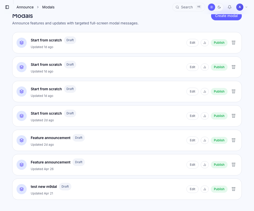
Modals are built in the dashboard under Announce → Modals.
- 1
Create a new modal
Go to Announce → Modals and click New modal. Choose a template or start from blank.
- 2
Build your content
The modal editor has a visual canvas. Add content blocks: - Text — headings and body copy - Image — upload or paste a URL - Button — primary CTA and optional secondary link You can have multiple slides (pages) in a single modal.
- 3
Configure settings
Set the close behavior (user can close / must click CTA), backdrop click to close, and animation style.
- 4
Add targeting and publish
Set targeting rules to control who sees the modal and when, then publish.
Multi-step modals
A modal can have multiple slides. Users advance through them with a Next button. This is useful for:
- Feature announcement with screenshots across multiple slides
- Welcome flows with 2–3 pages ("Welcome → What's new → Get started")
Each slide is edited independently in the canvas. Drag to reorder slides.
Button actions
Each button in a modal can:
- Close the modal — standard dismiss
- Navigate to a URL — send users to a page (opens in same tab or new tab)
- Start a flow — launch a tour after the modal closes
Targeting
Modals support the same targeting rules as all flows — URL matching, user attributes, and segments. See targeting overview.
Common modal targeting:
- Welcome modal: user attribute
createdAtwithin the last 1 day + frequency "Once" - Feature announcement: all users + frequency "Once" (resets when you publish a new version)
Frequency
| Setting | Behaviour | | ------------------- | --------------------------------------------------- | | Once | User sees it once, then never again | | Every session | Re-appears on every page load matching the URL rule | | Until completed | Shows until the user clicks the primary CTA button |
Analytics
The modal analytics page shows views, CTA click rate, and dismissal rate. If you have multiple slides, you can see dropoff per slide.
Was this helpful?
Related articles