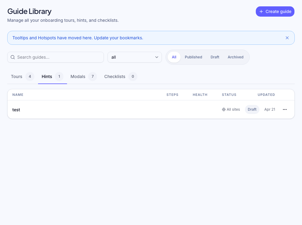
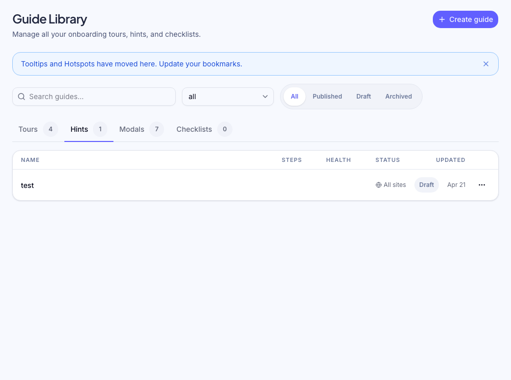
Tooltips
What is a tooltip?
A tooltip is a single-step hint anchored to a specific UI element. Unlike tours, tooltips are not sequential — each one stands alone. They appear automatically when targeting conditions are met.
Tooltips are best for:
- Explaining a feature inline without interrupting the user's flow
- Labelling unfamiliar UI elements (icon buttons, advanced settings)
- Surfacing tips for a specific page or feature
Tooltips vs tours
| | Tooltip | Tour | | -------- | -------------------- | --------------------- | | Steps | 1 | Multiple (sequential) | | Advance | Dismiss / time-based | User clicks Next | | Use case | Persistent hint | Guided walkthrough |
Creating a tooltip
Use the Chrome extension. Open the extension on your live site, click New Flow → Tooltip, then click the element you want to attach it to. Add your title and body text, then save.
Tooltip content
- Title (optional) — brief label
- Body — the hint text. One sentence is usually enough.
- Dismiss behavior — whether the tooltip shows a close button
Positioning
By default, Zenstep places the tooltip in the position with the most space. You can override this per tooltip:
- Top / Bottom / Left / Right
- Auto (recommended) — picks the best fit
Frequency settings
| Setting | Behaviour | | ------------------- | ------------------------------------- | | Once | Shows once per user, then never again | | Every session | Re-appears each page load | | Until completed | Shows until the user dismisses it |
Once is the right default for post-release feature announcements. Every session works well for persistent helper text on complex pages.
Targeting
Add targeting rules to show the tooltip only to relevant users and on the right page. Example: show a tooltip about a "Scale plan" feature only to users on the Scale plan.
See targeting overview for the full rules reference.
Stacking tooltips
You can have multiple tooltip flows active on the same page. Zenstep shows all tooltips whose targeting rules match. If multiple tooltips anchor to overlapping positions, review your layout — crowded tooltips hurt UX.
Editing a live tooltip
Changes to a published tooltip take effect immediately for users who haven't seen it yet. Users who have already dismissed a Once tooltip will not see the updated version.
To force a re-show after an edit (e.g., you rewrote the copy for a critical feature), change the frequency to Every session temporarily, then revert once users have seen the update.
Was this helpful?
Related articles